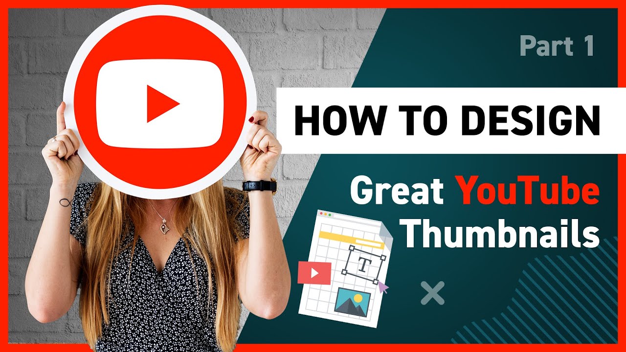
How to Create Effective YouTube Thumbnails
Unlock Clicks: Crafting Killer You Tube Thumbnails That Get Noticed
Hey there, future You Tube superstar! Ever scroll through You Tube and feel like some videos are justbeggingto be clicked, while others are lost in the digital wilderness? Chances are, the difference isn’t just the content, but the first impression: the thumbnail. Think of it like this: your thumbnail is the movie poster for your video, the book cover for your epic tale, the flashing neon sign screaming, "Watch ME!" in a sea of digital noise. But crafting a thumbnail that actuallyworks? That’s where the real magic happens.
Let's be honest, creating amazing content takes a lot of time, energy, and often, a little bit of your sanity. You pour your heart and soul into filming, editing, and perfecting your videos. You hit that upload button, practically buzzing with excitement, only to...crickets. The views are low, the engagement is practically nonexistent, and you're left wondering if all that effort was worth it. Sounds familiar? I bet it does. It's like throwing a party and nobody shows up. Ouch.
So, what's the problem? Well, your video might be a masterpiece, but if your thumbnail is bland, blurry, or just plain confusing, potential viewers will simply scroll right past it. They won't even give your video a chance! It's a harsh reality, but in the fast-paced world of online video, you have mere seconds to grab someone's attention. Your thumbnail is your first and often only opportunity to make a strong impression. It's the digital equivalent of a firm handshake and a winning smile.
The solution? Mastering the art of the effective You Tube thumbnail. I'm not talking about just slapping a screenshot on your video and calling it a day. I'm talking about crafting thumbnails that are visually appealing, informative, and irresistible. Thumbnails that practically force people to click and watch your content. Thumbnails that are so good, they make your competitors jealous.
Did you know that You Tube processes over 400 hours of video every single minute? That's insane! That's like watching the entire Lord of the Rings trilogy, extended editions, 80 times a minute! In that kind of chaotic environment, standing out is more important than ever.
And let’s not forget about the mobile users! More than 70% of You Tube views come from mobile devices. What looks good on a desktop screen might be a blurry mess on a phone. Your thumbnail needs to be eye-catching, even when it's tiny. It's like trying to read a billboard from a speeding car – clarity is key!
Think about some of your favorite You Tubers. What do their thumbnails have in common? Probably vibrant colors, clear text, and engaging expressions. They understand the power of a great thumbnail and they use it to their advantage. They know how to stop the scroll and entice viewers to click. They're practically thumbnail ninjas!
So, how can you become a thumbnail ninja yourself? That's what we're going to explore in this article. We'll dive into the essential elements of a killer You Tube thumbnail, from choosing the right colors and fonts to crafting compelling visuals that tell a story. We'll explore proven strategies and techniques that will help you stand out from the crowd and get more clicks. We'll uncover the secrets to creating thumbnails that not only look good but also accurately represent your content and attract the right audience.
Ready to transform your You Tube channel and unlock its full potential? Let's get started and turn those passive scrollers into dedicated viewers. Are you curious to learn the step-by-step process that will take your thumbnails from "meh" to "must-click"?
Crafting Click-Worthy Thumbnails:Your Ultimate Guide
Alright, friend, let’s dive deep into the world of You Tube thumbnails. This isn’t just about making something pretty; it’s about creating a visual magnet that pulls viewers to your content. We're going to explore practical techniques and strategies that you can implement right away. Forget the fluff; let's get to the good stuff!
• Know Your Audience: Tailor Your Thumbnails
Understanding your target audience is absolutely crucial. What are their interests? What kind of videos do they typically watch? What kind of visuals resonate with them? Imagine you're creating a cooking tutorial for college students. A thumbnail featuring a gourmet meal with fancy ingredients might not be as effective as one showing a simple, budget-friendly dish they can easily replicate.
Think of it like this: you wouldn't wear a tuxedo to a beach party, right? The same principle applies to your thumbnails. Tailor them to the specific tastes and preferences of your audience. If you have analytics data, dive in! Look at what videos perform well with your audience and see if you can identify any common visual themes in the thumbnails. If your audience loves bright colors and bold fonts, then incorporate that into your design.
Real-world example: a gaming channel targeting younger viewers might use bright, saturated colors, exaggerated expressions, and popular game characters in their thumbnails. On the other hand, a finance channel targeting older, more professional viewers might opt for a cleaner, more minimalist design with serious expressions and relevant charts or graphs.
• Size Matters: Optimizing for Every Screen
Remember that over 70% of You Tube views come from mobile devices. Your thumbnail needs to look good not just on a desktop screen but also on a tiny smartphone screen. That means choosing the right dimensions and optimizing for clarity.
The recommended You Tube thumbnail size is 1280x720 pixels (with a minimum width of 640 pixels). Use a 16:9 aspect ratio. These dimensions ensure that your thumbnail will look sharp and clear on all devices. Avoid using small text or intricate details that will be difficult to see on smaller screens.
Think of it like this: you're designing a poster that needs to be seen both up close and from a distance. You need to make sure that the key elements are easily visible and legible, no matter how far away someone is. Pro Tip: Before uploading, view your thumbnail on your smartphone to see how it looks on a smaller screen. Make adjustments as needed to ensure clarity and readability.
• The Power of Faces: Human Connection
Human faces are incredibly powerful. We are hardwired to pay attention to them. Including a face in your thumbnail can instantly grab attention and create a sense of connection with the viewer.
But not just any face will do. Aim for genuine, expressive faces that convey the emotion or message of your video. Think about it: would you rather click on a thumbnail featuring a blank, emotionless stare, or one with a genuine smile or a surprised expression?
Real-world example: a reaction video thumbnail featuring an exaggerated, surprised expression can be incredibly effective in grabbing attention. A beauty tutorial thumbnail showing a smiling face and flawless makeup can entice viewers to click and learn how to achieve the same look. Just be sure the expression is relevant to the video content! No one likes clickbait.
Pro Tip: Use close-up shots of faces and make sure the lighting is good. Avoid using blurry or pixelated images.
• Colors That Pop: Using Color Psychology
Colors have a powerful impact on our emotions and perceptions. Using the right colors in your thumbnail can help you attract the right audience and convey the right message.
For example, red is often associated with excitement, energy, and passion. It can be a great color to use if you want to grab attention and create a sense of urgency. Blue, on the other hand, is often associated with trust, calmness, and stability. It can be a good color to use if you want to convey a sense of professionalism and reliability. Yellow is associated with happiness, optimism, and energy. It's a bright, cheerful color that can be effective in attracting attention. Green is associated with nature, growth, and health. It can be a good color to use if you want to convey a sense of freshness and vitality.
Consider using contrasting colors to make your thumbnail stand out. For example, if your background is dark, use bright, light-colored text. If your background is light, use dark-colored text.
Real-world example: a food channel might use warm, inviting colors like orange, yellow, and red to make their food look more appetizing. A tech channel might use cool, futuristic colors like blue and silver to convey a sense of innovation and technology.
• Text That Tells: Clear and Concise Messaging
Your thumbnail text should be clear, concise, and easy to read, even on small screens. Avoid using long, complicated sentences. Instead, focus on conveying the key message of your video in just a few words.
Choose a font that is legible and easy to read. Avoid using overly decorative or stylized fonts. Use a font size that is large enough to be seen on small screens.
Consider adding a border or background to your text to make it stand out from the background image. Use contrasting colors to make the text more visible.
Real-world example: instead of using a long, descriptive title like "How to Bake the Most Delicious Chocolate Chip Cookies You've Ever Tasted," try using a shorter, more attention-grabbing phrase like "Best Chocolate Chip Cookies EVER!"
Pro Tip: Test different text options and see which ones get the most clicks.
• Consistency is Key: Building Brand Recognition
Maintaining a consistent visual style across all of your thumbnails can help you build brand recognition and make your videos more easily identifiable.
Choose a consistent color palette, font, and overall design style for your thumbnails. Use your logo or branding elements in your thumbnails to reinforce your brand identity. This consistency creates a visual link between your videos and your brand, making it easier for viewers to recognize and remember you.
Think of it like this: when you see the golden arches of Mc Donald's, you instantly know what to expect. The same principle applies to your You Tube thumbnails.
Real-world example: many successful You Tubers use the same font and color scheme in all of their thumbnails. They may also include a consistent element, such as their logo or a signature image.
• A/B Testing: The Science of Success
The best way to determine what works and what doesn't is to A/B test your thumbnails. This involves creating two different versions of a thumbnail and then tracking which one gets more clicks.
You Tube allows you to change your thumbnails at any time, so you can easily test different options and see which ones perform best. Experiment with different colors, fonts, images, and text. Monitor your click-through rate (CTR) to see which thumbnails are most effective.
Think of it like this: you're a scientist conducting an experiment. You're testing different variables to see which ones produce the best results.
Real-world example: you might test two different versions of a thumbnail, one with a red background and one with a blue background. After a week, you can analyze the data and see which thumbnail had a higher CTR.
• Beyond the Basics: Storytelling in a Still Image
While all the above points are critical, mastering thumbnails goes beyond technical details. It’s about telling a story, sparking curiosity, and hinting at the value your video offers.
Consider the overall composition of your thumbnail. Does it guide the viewer's eye to the most important elements? Does it create a sense of anticipation or excitement?
Don’t be afraid to experiment with different styles and techniques. Try adding visual metaphors, unexpected juxtapositions, or abstract elements to make your thumbnails more visually interesting. Remember, the goal is to stand out from the crowd and grab attention.
Real-world example: a thumbnail for a travel vlog might feature a stunning landscape shot combined with a close-up of the vlogger's face looking awestruck. This combination creates a sense of wonder and invites viewers to experience the journey with the vlogger.
Frequently Asked Questions
Okay, let's tackle some common questions about creating effective You Tube thumbnails:
• What if I don't have Photoshop? Are there any free alternatives?
Absolutely! While Photoshop is a powerful tool, there are plenty of free and user-friendly alternatives available. Canva is a popular choice, offering a wide range of templates, graphics, and fonts. GIMP is another great option, providing more advanced image editing features similar to Photoshop. Pic Monkey is also a solid choice. Experiment with different tools to find one that suits your needs and skill level.
• How often should I change my thumbnails?
It depends. If a video is performing well, there's usually no need to change the thumbnail. However, if a video is underperforming, changing the thumbnail can be a great way to boost its visibility and click-through rate. Consider changing your thumbnail if:
The video is old and has become buried in search results.
You've made significant changes to the video content.
You want to target a different audience.
• What if I'm not a designer? How can I create professional-looking thumbnails?
Don't worry! You don't need to be a professional designer to create effective thumbnails. Start by using pre-made templates and customizing them to your needs. Focus on using high-quality images, clear text, and a consistent color scheme. Look at what other successful You Tubers in your niche are doing and try to emulate their style. And don't be afraid to ask for feedback from friends or fellow creators.
• How important is it to accurately represent the video content in the thumbnail?
It's extremely important! While it's tempting to use clickbait thumbnails to attract attention, doing so can damage your credibility and alienate your audience. Your thumbnail should accurately reflect the content of your video. If your thumbnail is misleading, viewers will quickly realize it and click away, resulting in low watch time and negative feedback. Focus on creating thumbnails that are both attention-grabbing and honest.
Your Thumbnail Transformation Starts Now!
So there you have it, friends! A deep dive into the art and science of creating killer You Tube thumbnails. We've covered everything from understanding your audience to mastering color psychology to A/B testing your designs. Remember, your thumbnail is the first impression you make on potential viewers, so make it count! It's your digital handshake, your movie poster, your neon sign in the bustling world of You Tube.
The key takeaway here is this: effective thumbnails aren’t just about aesthetics; they’re about strategy. They're about understanding your audience, communicating your message clearly, and standing out from the crowd. They're about telling a story in a single, captivating image.
Now, I challenge you to take action! Review your existing thumbnails. Are they truly representative of your content? Are they visually appealing? Are they optimized for mobile viewing? Identify at least three thumbnails that you can improve and start experimenting with different designs. Use the tips and techniques we've discussed in this article to create thumbnails that are more engaging, more informative, and more irresistible.
Don't be afraid to get creative, to experiment, and to iterate. The best way to learn is by doing. And remember, A/B testing is your best friend. Track your results, analyze your data, and continuously refine your thumbnails to maximize your click-through rate and grow your You Tube channel.
Stop leaving views on the table! Your video could be the next viral sensation, but it'll never happen if no one clicks on it. You've put in the hard work to create amazing content; now, make sure it gets the attention it deserves.
So, what are you waiting for? Go forth and create thumbnails that are so good, they practically scream, "Watch ME!" Are you ready to take your You Tube channel to the next level, one click-worthy thumbnail at a time?
Post a Comment for "How to Create Effective YouTube Thumbnails"
Post a Comment