How to Optimize Your Website for Mobile Devices
Unlock Mobile Success: A Simple Guide to Optimizing Your Website
Hey there, website warriors! Ever noticed how sometimes browsing a website on your phone feels like trying to squeeze an elephant through a keyhole? It's clunky, frustrating, and makes you want to chuck your phone across the room. Well, guess what? Your visitors feel the same way when your website isn't optimized for mobile. We're living in a mobile-first world, friends! More people are browsing the internet on their smartphones and tablets than ever before. In fact, according to Statista, mobile devices accounted for approximately 60% of global website traffic in 2023. If your site isn't playing nice with those tiny screens, you're basically leaving money on the table – and driving potential customers straight into the arms of your competitors.
Think of it like this: imagine opening a restaurant. You wouldn't just throw some tables and chairs in a room and call it a day, would you? You'd consider the ambiance, the menu, the seating arrangement – everything to make your customers comfortable and want to come back for more. Your website is the online equivalent of your restaurant. If it's not mobile-friendly, it's like serving your customers burnt food on a wobbly table. Not exactly a recipe for success, right? The truth is, a poorly optimized mobile experience can lead to sky-high bounce rates (people leaving your site almost immediately), plummeting conversion rates (fewer sales, sign-ups, etc.), and a general feeling of "ugh" from your visitors.
But don't despair! The good news is that optimizing your website for mobile doesn't have to be a Herculean task. It's more like a series of small tweaks and adjustments that can make a huge difference. It's about making your website accessible, user-friendly, and downright enjoyable to browse on any device. It's about understanding how people use their phones and tailoring your website to their needs. And that’s where we come in. We’re going to break down the process into bite-sized, actionable steps that you can implement right away. No tech wizardry required, promise!
Think of mobile optimization as an investment in your website's future. It's not just about keeping up with the times; it's about providing a better experience for your users, improving your search engine rankings (Google loves mobile-friendly sites!), and ultimately, growing your business. So, are you ready to unlock the secrets to mobile success? Are you ready to transform your website from a mobile monster into a mobile masterpiece? Stick with us, and we'll show you how. What if you could see your website transform into a lead-generating machine, all thanks to a few simple tweaks? Let's dive in and find out!
Let's Get Mobile-Friendly: A Step-by-Step Guide
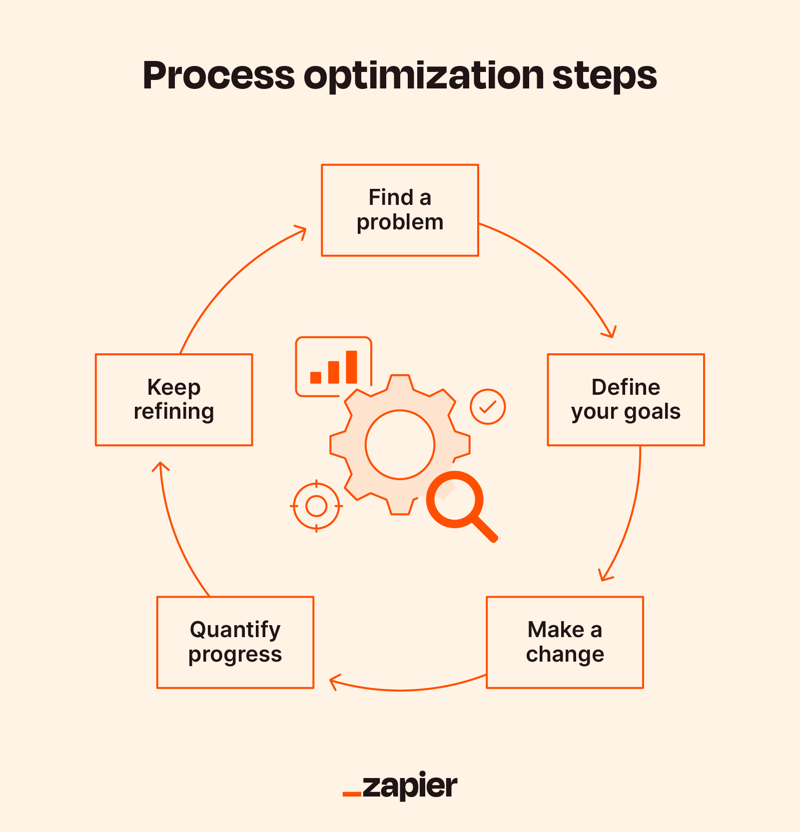
Alright, friends, let's get down to brass tacks. We're going to walk you through the key steps to optimizing your website for mobile devices. Remember, it's all about creating a seamless and enjoyable experience for your mobile visitors. Let's make your website shine on every screen!
• Embrace Responsive Design: The Cornerstone of Mobile Optimization
This is the big one, folks. Responsive design is the foundation upon which all mobile-friendly websites are built. What exactly is it? In a nutshell, responsive design means that your website automatically adjusts its layout and content to fit the screen size of the device it's being viewed on. No more pinching and zooming to read text or struggling to click tiny buttons. It's like magic! Instead of creating separate websites for desktop and mobile, you have one website that adapts to any device. It is the most flexible and effective method.
Think of it as a chameleon that changes its colors to blend in with its surroundings. Your website will seamlessly transform to look great on a desktop computer, a tablet, or a smartphone. This not only provides a better user experience but also simplifies website maintenance. You only have one website to update and manage, which saves you time and effort. How do you implement responsive design? If you're using a Content Management System (CMS) like Word Press, chances are your theme is already responsive. Most modern Word Press themes are built with responsive design in mind. However, it's always a good idea to test your website on different devices to make sure everything looks and functions as it should.
If you're not using a CMS, you'll need to implement responsive design using CSS media queries. These are bits of code that tell your website how to adapt to different screen sizes. While it might sound a bit technical, there are plenty of online resources and tutorials that can guide you through the process. Remember, responsive design is an investment that pays off in the long run. It's the key to creating a mobile-friendly website that provides a great user experience and keeps visitors coming back for more.
• Optimize Images: Speed Up Your Mobile Site
Large, unoptimized images are a major culprit when it comes to slow-loading websites. And let's face it, nobody likes waiting for a website to load, especially on a mobile device with a potentially slower internet connection. Slow loading times can kill your website's ranking. Optimizing your images is all about reducing their file size without sacrificing too much quality. There are several ways to do this. First, choose the right file format. For photographs, JPEG is usually the best option, as it offers a good balance between quality and file size. For graphics with sharp lines and text, PNG is often a better choice.
Next, compress your images. There are many free online tools and plugins that can help you compress your images without significantly reducing their quality. Short Pixel, Tiny PNG, and Image Optim are all popular options. Aim to reduce the file size of your images as much as possible without making them look blurry or pixelated. Finally, consider using responsive images. This means serving different versions of your images depending on the screen size of the device. For example, you could serve a smaller image to mobile users and a larger image to desktop users. This can significantly improve your website's loading speed on mobile devices.
Remember, every second counts when it comes to website loading speed. Optimizing your images is a simple but effective way to improve your website's performance and provide a better experience for your mobile visitors. Image optimization is more than just a technical detail; it's an integral part of creating a user-friendly and engaging website. It shows that you care about your visitors' time and that you're committed to providing them with the best possible experience.
• Simplify Navigation: Make it Easy for Mobile Users to Find What They Need
Navigating a website on a mobile device can be tricky, especially if the navigation menu is cluttered and difficult to use. Think about your own experience browsing websites on your phone. Have you ever struggled to find what you're looking for because the navigation menu was too small or too complex? It's frustrating, right? That's why simplifying your navigation is crucial for mobile optimization. Start by streamlining your navigation menu. Remove any unnecessary items and focus on the most important pages of your website.
Use clear and concise labels for your menu items. Avoid jargon or technical terms that your visitors might not understand. Make sure your navigation menu is easy to access on mobile devices. A common solution is to use a "hamburger menu," which is a three-line icon that expands to reveal the full navigation menu when clicked. This keeps your navigation menu out of the way on small screens while still providing easy access to all of your website's pages. Make sure your search bar is also prominently displayed and easy to use. Many mobile users rely on the search function to find what they're looking for quickly.
Consider using breadcrumbs, which are a trail of links that show users where they are on your website. This can be especially helpful for websites with complex structures. Finally, make sure your website is easy to navigate using touch gestures. Ensure that buttons and links are large enough to be easily tapped on a mobile device. Avoid using small or closely spaced elements that can be difficult to click. A simplified and intuitive navigation menu is essential for creating a positive user experience on mobile devices. It allows visitors to quickly and easily find what they need, which can lead to increased engagement and conversions.
• Use Readable Fonts and Adequate Spacing: Improve Mobile Readability
Trying to read small, cramped text on a mobile device is a recipe for eye strain and frustration. Make sure your website uses readable fonts and adequate spacing to improve readability on mobile devices. Choose fonts that are easy to read on small screens. Avoid using overly decorative or complex fonts that can be difficult to decipher. San-serif fonts like Arial, Helvetica, and Open Sans are generally good choices for mobile websites. Increase the font size of your body text to make it easier to read. A font size of at least 16 pixels is a good starting point.
Adjust the line height and letter spacing to improve readability. Adequate line height and letter spacing can make the text appear less cramped and easier to follow. Use white space effectively to break up large blocks of text and create visual breathing room. White space can help to guide the reader's eye and make the text more inviting to read. Pay attention to the contrast between your text and background colors. Make sure there is sufficient contrast to make the text easy to read. Avoid using light text on a light background or dark text on a dark background.
Test your website on different mobile devices to make sure the text is readable. What looks good on one device might not look so good on another. Remember, readability is key to keeping visitors engaged with your website. If your website is difficult to read on a mobile device, visitors are likely to leave quickly. By using readable fonts, adequate spacing, and good contrast, you can create a more enjoyable and user-friendly experience for your mobile visitors.
• Optimize for Touch: Make Interactions Easy and Intuitive
Mobile devices are all about touch. Forget about mouse clicks and hovering – your website needs to be optimized for touch interactions. This means making sure that buttons and links are large enough to be easily tapped, and that there's enough space between them to prevent accidental clicks. Make sure your buttons and links are at least 44x44 pixels in size. This is a good rule of thumb to ensure that they are easily tappable on mobile devices. Add sufficient spacing between buttons and links to prevent accidental clicks.
Avoid placing buttons too close together, as this can lead to users accidentally tapping the wrong button. Use clear and intuitive icons to represent different actions. Icons can help to make your website more visually appealing and easier to understand. Make sure your forms are easy to fill out on mobile devices. Use large, clear input fields and provide helpful error messages. Consider using auto-fill to make it even easier for users to fill out forms. Test your website on different touch devices to make sure everything works as expected.
What works well on one device might not work so well on another. By optimizing your website for touch, you can create a more seamless and intuitive experience for your mobile visitors. This can lead to increased engagement, conversions, and customer satisfaction. Remember, mobile devices are all about touch, so it's essential to make sure your website is designed with touch interactions in mind.
• Leverage Browser Caching: Speed Up Repeat Visits
Browser caching is a technique that allows web browsers to store static files, such as images, CSS files, and Java Script files, on a user's device. When a user revisits your website, the browser can load these files from the cache instead of downloading them again from the server. This can significantly speed up your website's loading time, especially for repeat visitors. To leverage browser caching, you need to configure your web server to send the appropriate caching headers. These headers tell the browser how long to store the files in the cache.
There are several ways to configure browser caching, depending on your web server. If you're using Apache, you can use the .htaccess file to configure caching headers. If you're using Nginx, you can configure caching headers in your server configuration file. You can also use a Content Delivery Network (CDN) to leverage browser caching. A CDN is a network of servers that caches your website's content and delivers it to users from the server that is closest to them. This can significantly improve your website's loading time, especially for users who are located far away from your web server.
Leveraging browser caching is a simple but effective way to improve your website's performance and provide a better experience for your visitors. By caching static files on a user's device, you can significantly reduce your website's loading time, especially for repeat visitors. Remember, every second counts when it comes to website loading speed. Browser caching can help you shave off precious milliseconds and keep your visitors engaged with your website.
• Test, Test, Test: Ensure a Seamless Mobile Experience
The final and perhaps most important step is to test your website thoroughly on different mobile devices and browsers. What looks good on one device might not look so good on another. Different devices have different screen sizes, resolutions, and operating systems. It's essential to test your website on a variety of devices to ensure that it looks and functions as it should on all of them. Use mobile-friendly testing tools to check your website's mobile-friendliness. Google's Mobile-Friendly Test is a free tool that can help you identify any mobile-friendliness issues.
Use browser developer tools to simulate different mobile devices and screen sizes. Most modern browsers have built-in developer tools that allow you to simulate different mobile devices and screen sizes. This can be a useful way to test your website on different devices without having to physically own them. Ask friends and family to test your website on their mobile devices. Get feedback from real users on how your website looks and functions on their devices.
Pay attention to your website's analytics to identify any mobile-specific issues. Your website's analytics can provide valuable insights into how mobile users are interacting with your website. Look for any patterns or trends that might indicate mobile-specific issues. Testing is an ongoing process. As you make changes to your website, it's essential to retest it to ensure that it remains mobile-friendly. By testing your website thoroughly on different mobile devices and browsers, you can ensure that it provides a seamless and enjoyable experience for all of your mobile visitors. This can lead to increased engagement, conversions, and customer satisfaction.
Frequently Asked Questions (FAQ)
Let's tackle some common questions about mobile optimization.
• Why is mobile optimization so important?
Mobile optimization is crucial because a significant portion of internet traffic comes from mobile devices. A mobile-friendly website ensures a better user experience, reduces bounce rates, improves search engine rankings, and increases conversions. Ignoring mobile optimization means missing out on a huge segment of potential customers.
• How do I know if my website is mobile-friendly?
You can use Google's Mobile-Friendly Test tool. Simply enter your website's URL, and the tool will analyze your website and provide feedback on its mobile-friendliness. You can also manually test your website on different mobile devices and browsers.
• What's the difference between responsive design and a mobile website?
Responsive design means your website adapts to different screen sizes using a single code base. A mobile website is a separate version of your website specifically designed for mobile devices. Responsive design is generally preferred because it's easier to maintain and provides a more consistent user experience.
• How much does it cost to optimize my website for mobile?
The cost of mobile optimization varies depending on the complexity of your website and the methods you choose. If you're using a CMS like Word Press with a responsive theme, the cost might be minimal. However, if you need to hire a web developer to implement responsive design or create a mobile website, the cost could be more significant.
Wrapping Up: Your Path to Mobile Domination
And there you have it, friends! A comprehensive guide to optimizing your website for mobile devices. We've covered everything from responsive design to image optimization to touch interactions. By implementing these strategies, you can transform your website into a mobile powerhouse that attracts, engages, and converts mobile users. Remember, mobile optimization is not a one-time task; it's an ongoing process. As new devices and technologies emerge, you'll need to continue to adapt and optimize your website to stay ahead of the curve. But the effort is well worth it. A mobile-friendly website is essential for success in today's mobile-first world.
Now it's your turn. Take what you've learned in this guide and start implementing it on your website. Don't be afraid to experiment and try new things. The key is to keep testing and refining your approach until you find what works best for your audience. Are you ready to take your website to the next level? Start optimizing your website for mobile devices today and watch your traffic, engagement, and conversions soar. Go forth and conquer the mobile web! And hey, what's one small change you can make to your website today to make it more mobile-friendly?
Post a Comment for "How to Optimize Your Website for Mobile Devices"
Post a Comment